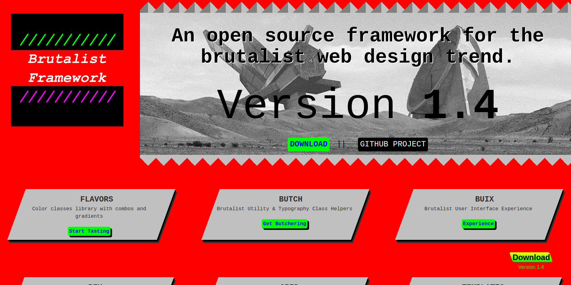
A few days ago a journalist for net magazine asked me what I thought about Brutalism in web design, perhaps after finding my project site listed on BrutalistWebsites.com. He was kind enough to publish a portion of the interview on the magazine, but for the sake of completeness, I am publishing it here fully.
> What’s the appeal of brutalist web design?
I often find that websites with a large amount of content should remove decorations to the very minimum. When Information Overload is at stake, sticking with what truly matters on a page decreases complexity. Just look at the home page of Google. 17 years ago, Altavista was a thing and their home page was cluttered with useless stuff. Google came in with a website that did one thing, did it really well, and was unconcerned with looking pretty. Google definitely gives more attention to the eye these days, but the core remained the same. It shouldn’t be confused with minimalism, but often it’s a form of design from nerds for nerds.
> And what about the downsides?
The downside is the intimidation factor. Many academic websites of many professors around the world look unintentionally brutalist, so stern and austere with too much contrast and plenty of text. At times it feels like it’s done on purpose – as if the experience was designed to remind of a church of which they are the priests. Lack of usability can be another downside, although that probably does not apply for modern websites which sometimes seem to mimic brutalism.
> Is there an element of nostalgia for the days of Geocities and banging out a bit of HTML and hoping for the best?
To be frank, I think brutalism has little to do with the look and feel of Geocities. The millions of home pages hosted on Geocities had a very peculiar sort of baroqueness – it was a style that was not intentionally designed, but that had just been thrown together haphazardly. Certainly my Geocities page looked like that. In that regards the aesthetics of Geocities were more resembling a Bowerbird nest, collecting and displaying colorful things found scattered around – something that was marvelously represented by Cameron Askin in his Cameron’s World.
> Where do you expect this scene to go?
Brutalism is here to stay. It’s a counterbalance movement to times of superficiality and our civilization seems to be bound to go through such cycles. It may be hiding at times, but you can be certain that it will spring back to life whenever ruggedness is once again a virtue.

Post a Comment through Mastodon
If you have a Mastodon account, .